Revamp Your Retail Series: Merchandising
What goes unseen goes unsold; if customers never see the product, they can’t buy it. This makes merchandising a keystone of retail sales.
In mainstream marketing, merchandising research is often conducted with identical packages of boxes or bottles. Merchandising “minimally packaged” goods that are often unique (like plants or fashion) can present a different challenge for retailers.
What the Customer Sees (and Doesn’t See)
For nearly 20 years, researchers at Michigan State University, along with colleagues at other universities, have studied multiple aspects of plant merchandising using high-tech eye-tracking glasses. The glasses enable researchers to measure the factors that consumers visually see (or ignore) that go into (or aren’t considered) in the purchase decision. These studies were generously funded by the USDA Federal-State Marketing Improvement Grant program, the Horticultural Research Institute, and industry and university grants.
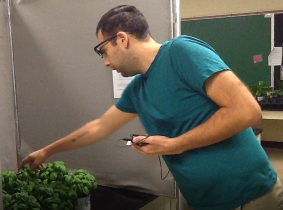
Eye movement is the fastest movement the human body can make. Most of the information our brains process enters through our eyes. With roots in the medical field, eye-tracking glasses enable researchers to better understand the purchase process and the information consumers look at to make their purchase decisions. You might say the eyes are the gateway to consumers’ thoughts.
Making Product Visible
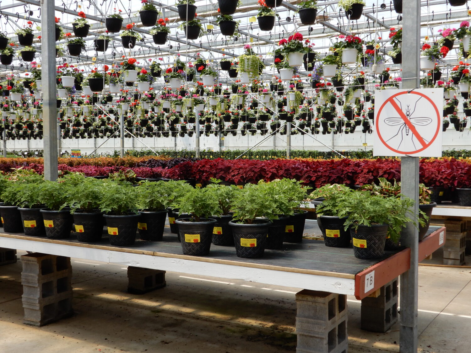
Display fixtures were one aspect of merchandising we investigated. Typically, most retailers use either flat or horizontal display fixtures or vertical steps or shelf display fixtures. The flat display format is relatively common because it increases the ease with which plants can be watered, stock can be replenished, and plants receive a similar amount of light from above the display.
The lower bench heights of flat displays enabled consumers to see more plant choices, while taller horizontal shelves reduced what consumers could see, especially when the person was of short stature. Lowering bench height — without being a tripping hazard — improves plant visibility on the horizontal display. Greater visibility can lead to longer time viewing the display.
One key finding across nearly all the studies is that if someone looks longer, they are more likely to make a purchase.
Plant(s) Matter
The different kinds of plants merchandised on a display also matter. We found that having only one genus in a display gave potential customers more plant choices within that one item, but they visually connected with very few of the plants. In other words, when there is a lot of that one type of plant, consumers don’t evaluate or “see” all the plants in that display. In fact, they looked at less than 25% of the total plants in the display!
Use mass horizontal displays for lower-margin items or seasonal items that move quickly. Keep the display full by reducing the number of benches or tables so the display doesn’t look picked over.
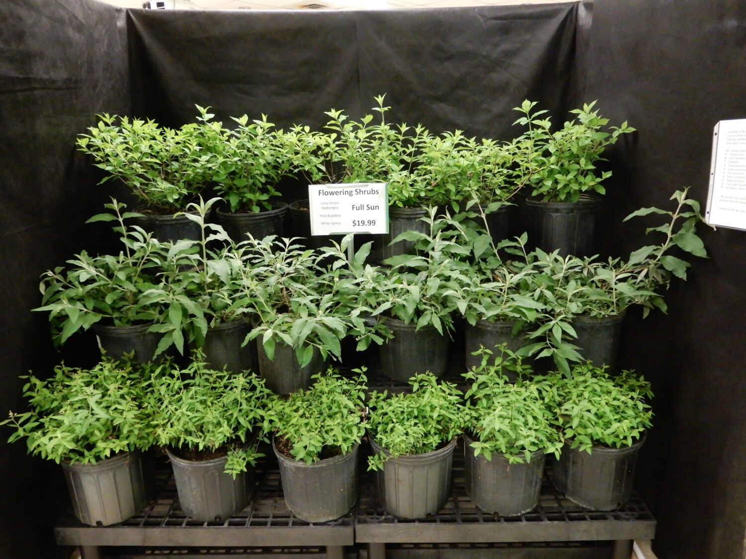
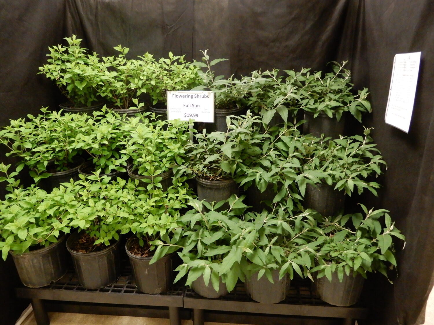
Tiered shelves or vertical displays are another type of display for plant material. Research results showed consumers “read” vertical displays very much like they read a book: line by line, starting at the top row of a vertical display. When we merchandised plants horizontally (stripes going across the bench), that type of design made it much easier and faster for consumers to view and think about — or cognitively process — more plants. Their visual gaze was very much like reading a book, moving horizontally across the rows.
When we merchandised plants in vertical stripes, however, that type of merchandising slowed down the consumer and gave them more time to think about the alternatives in the display. Looking longer often leads to an increased likelihood of making a purchase.
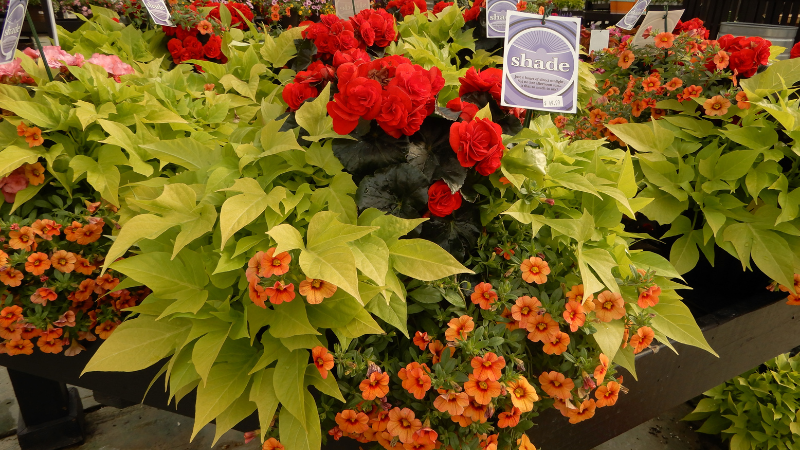
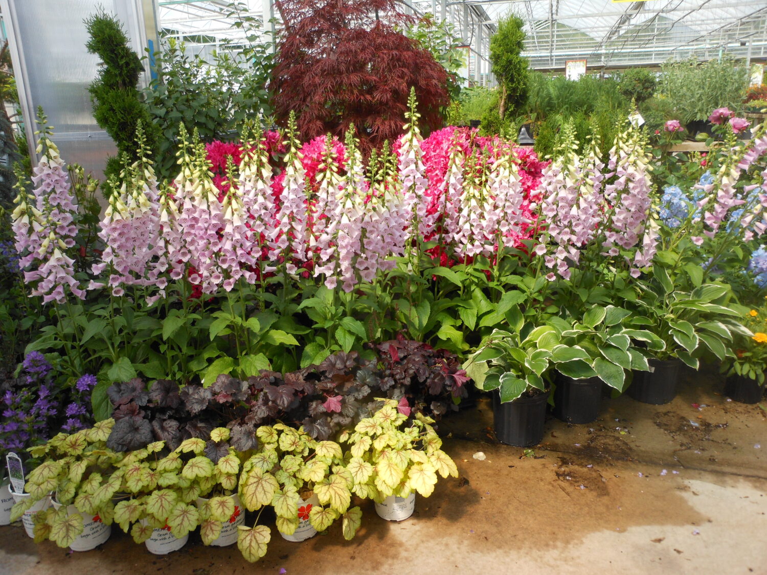
Increasing the diversity of plants in a display increased the probability that people would buy something from it. Merchandise several types of plants together that would naturally be planted together to capture more attention. For example, grouping perennials ideally suited to the shade can give customers pause to look at the grouping. Grouping plants together as they might be found in the landscape also encourages multiple unit purchases.
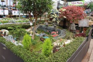
Merchandising the plant where it can be used, or suggesting a use by placing the plant in a particular situation, makes a difference in how much consumers are willing to pay for that plant. Utilitarian products are, by definition, useful. For example, basil or parsley can be used for cooking or garnishing. But some plants are perceived to be more hedonic and valued more for their beauty. Some plants can be merchandised as both utilitarian and hedonic.
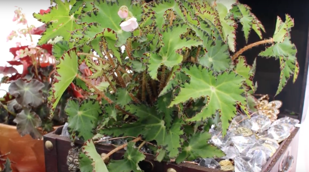
But which type of plant (utilitarian or hedonic) are consumers willing to pay more for? When put in a pretty setting (versus in a utilitarian setting), consumers were willing to pay more for an identical plant set in that pretty or hedonic setting. This research finding has implications for both online and in-store retailing.
Want to encourage customers to buy an item at a higher price point? Be sure to use a beautiful or at least aesthetically pleasing setting rather than simply putting plants on a bench. Benches can appear more utilitarian than hedonic.
Movement Draws the Eye
Our eyes are wired to detect movement, pointing us to fight-or-flight responses. Today, we can capitalize on our visual attention to movement to draw customers’ attention to certain displays with movement.
Flags or banners that wave in the breeze are inexpensive, portable and colorful ways to attract attention to movement. Educational video loops on televisions are another way to bring consumers nearer to a display — their movement and sound can both attract attention. Waterfalls or any water movement can be calming and eye-catching, especially if the retailer has water or bog plants merchandised nearby.
Color Theory
While our research didn’t delve much into color, we know from other studies that different colors can attract attention differently. We are primed to stop at stop signs and red lights, so red is a color that commands attention.
Color blocks can entice customers to look longer. They may home in on their favorite color, but give them a bit more to consider by displaying a color wheel nearby. Colors adjacent to each other on the color wheel create a soft contrast, while colors opposite each other show a bright direct contrast. Creating a color block display with a color wheel could bring customers closer to considering multiple plant purchases. Have colorful containers nearby as well to encourage those add-on purchases.
Merchandising is the attractive display of products to stimulate purchases. Consider how customers interact with products and how your displays can influence not only how they look at products but also whether they’ll buy them.
For an enhanced reading experience, view this article in our digital edition.






 Videos