Deciphering the Color Code for More Sales
It’s the one decision you keep putting off — what color to paint the walls?! Some people live with a patchwork of paint samples on their walls for years … unable to choose. Others “play it safe” with neutral everything (and wonder why their home lacks personality). Either of those sound familiar?
You want a home that feels cohesive and inviting. But one trip to the paint chip aisle can be instantly overwhelming. And unless you studied art, you likely received no guidance on color choice beyond your Crayola 64 box and your mom or a friend telling you what does or doesn’t look good in an outfit choice.
So how do we address this in a retail setting when we’re supposed to not only be making sales but also giving design advice in a fast-paced environment with little to no accurate information from customers? We start with some basics.
What are the Five Impact Points of Color?
Colors stir impulses and promote responses in people, compelling them to act to satisfy a want or need. Department store buyers have known forever that a red sweater at store A may fly off the racks while the same sweater in store C may linger. There are a number of reasons for this. Some are physical, location related, and some are economically related. Sometimes it is simply a tactical reason on behalf of the buyer to choose where a particular color sweater may get shipped over another — that’s called creating demand.
In your garden center, have you ever asked a buyer or salesperson why they think one color sells well over another? My hunch is that you will get some sophisticated answers.
Being on the frontlines with your daily customers, they pick up some key information about seasonal color preferences and even a location for where one particular color sells better over another in a nursery display.
Here is a brief five part look at how color is integral to your horticultural sales strategies.
1. Color preferences are heavily influenced by the region of the country where you live and work.
If you imagine the country divided into sections both by North, South, East and West as well as by time zones, you will notice some color preference patterns. If we go back to the buyer with the sweater example, a warm gold- toned sweater will end up on the clearance racks lickety split in the predominantly gray winter of the Northwest because of its lack of cooler tones. The same color of sweater, however, will fly off the rack in Arizona where the regional colors of the landscape, hours of sunlight and fashion influences are chock-full of those warm notes.
2. Male versus female differences in how we see color are indeed physical.
Men can see as many as 300,000 color variations. Pretty amazing huh? Not when you understand that women see as many as 3 million! That puts a whole new spin on the entire conversation in the paint department at the hardware store when the husband and wife are bickering over the six shades of white that she sees so clearly, when the husband says, “But, they are all white!”
As humans were evolving, males were created to be faster, stronger and more adaptive to the skill of bringing home the largest kill to provide for the tribe. Therefore, the color of the fastest animal was not the priority. The females were evolving skills at the same time that made the priority picking out fine-tuned details, for example this color of berry or root will poison the family, and this color will not.
When you are in the garden center and you watch a couple interacting over which plants to buy, watch very closely his reaction to colors versus hers. Men will typically be much more enthusiastic about bolder, clearer colors where women will most likely be attracted by the interplay and subtle differences in how the colors relate to each other.
3. Skin color, eye color and hair color are important cues to knowing which colors a person will likely prefer.
A blond-haired, blue-eyed person will generally choose a softer palette of colors, while a dark-haired and dark-eyed person will lean more toward colors that are bright and showy.
Think of the differences in culture, décor and climate between Brazil and Norway. Now, when you meet a customer in the garden center, before they have even given you parameters for their choices, you are already one-step ahead and look like a sales genius.
A fun little game for employees to see this in action would be to casually track the color of the cars in the parking lot versus the customer driving them, what they were wearing and what their hair and eye color were.
Other fun insight can be gained by good probing sales questions like “What color is your house?” or “How would you characterize your décor style?”
4. Color trends and color perception have great impact on what sells and how much it sells.
As we all know, branding with colors is one way to attract attention. We see it in everything from food to tools and technology. But, what about the colors that change in favorability depending on season? Of course, the easy seasons are going to be the rich colors of autumn and the traditional colors of the holidays. Even those so-called dependable ideas are changing now with the rich watery blue and teal tones being popular for holiday décor and fall decorating including sophisticated black, gray and navy.
5. The status of the economy and social drama also plays a larger role in color choices than you may realize.
For example, think of the theatrics and color of the Art Nouveau movement after the end of Prohibition. Life was a bit of a party for a few years in the Roaring ‘20s for many reasons. A woman’s right to vote was reflected in the bold use of color and lack of restricting formal wear and corsets. Then as the Depression era ensued, gray, brown and drab was the uniform of the day.
As our economy comes out of our last few years of drastic change and upheaval, are there colors that you notice making resurgence? Or are new colors getting attention as never before?
I am not entirely convinced that Pantone LLC alone was responsible for orange being a giant among color influencers in 2012. Orange was at the beginning of the boom — then cars, appliances, furnishings, textiles etc. However, in the last few years in garden sales, I hear from buyers that they can’t ever stock enough of anything orange.
Looking to the future of color once again — Pantone named Marsala as the Color of the Year for 2015 and it’s just now filtered down to ready-to-wear fashion this year in a big way. So be mindful of the lag time in a color’s timing making it to market in popularity.
What are we going to see more of in the future? We’re already seeing hints for 2019 in a color called “Nicoll Blue” (a shade of periwinkle) after the recent New York Fashion Week’s completion.
In a recent Women’s Wear Daily article, the Color Institute listed its top 12 shades for next spring. In the mix were some more-fall-than-spring curveballs like toffee brown and mossy green. But the warm shades of pink, red and orange we look for after a brutal winter also make an appearance due to the political environment and women feeling empowered.
Your Authority
 What do you do to impart your authority in color choices? Growers, buyers, and retail nurseries and garden centers have the utmost opportunity to coordinate and plan like never before.
Sourcing quantities, sizes and particular colors of cultivars of plants as a project to plan for seasonally is the new normal when it comes to successfully differentiating yourself from your competitors. The days of simply ordering the standard red geranium on a certain date are long gone for the IGC channel.
As you have the technology to drill down on your customers buying habits, you also have the ability to take more risks to set up a successful launch of new plants and materials like never before!
How can you create demand for a new plant in a new color? Color is proven to light up the brain’s pleasure circuitry the same as chocolate or sex. It can be irresistible when a spectacular sunrise or sunset occurs during the season of few colors.
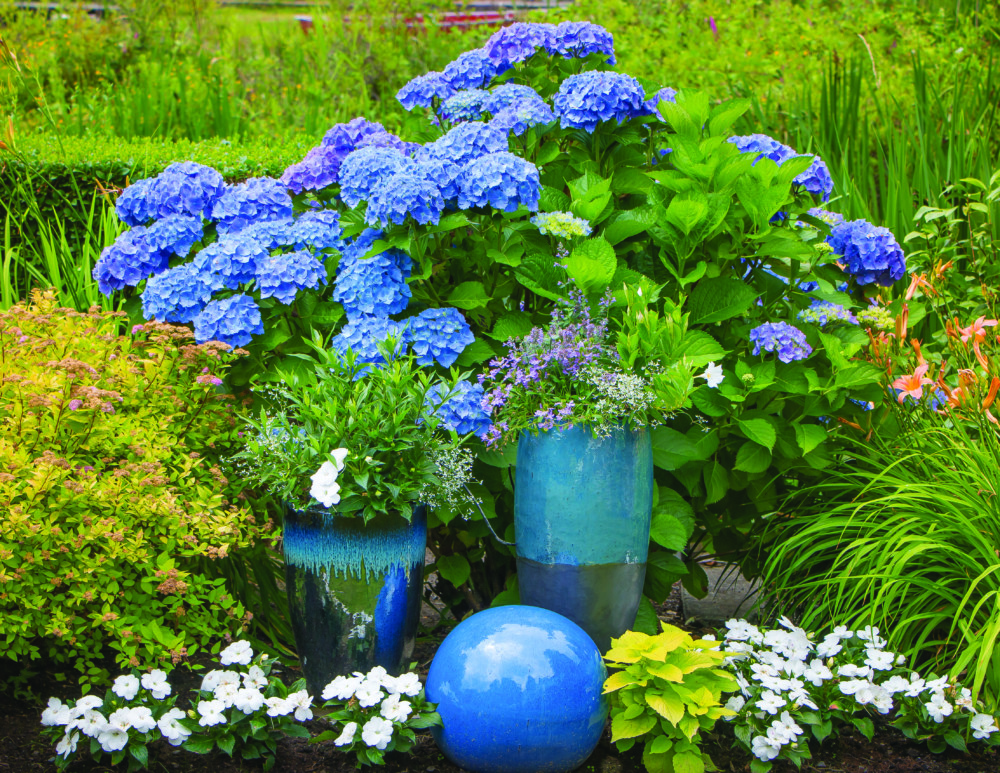
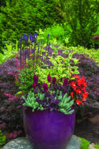
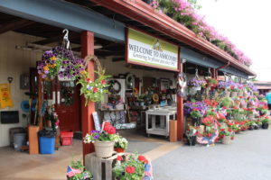
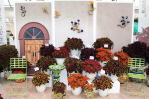
A solid mass of plants color blocked in a display can have the same impact when our customer walks into the nursery or garden center in February as well.
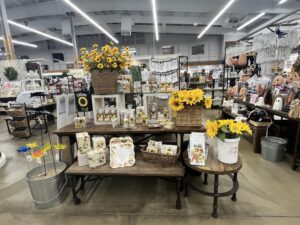
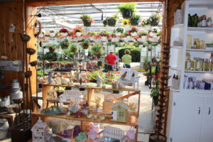
A successful display that depicts the story and creative use of new and different plant colors are showcased in a container display, hard goods display or a combination of both and more.
A good buyer who is keeping detailed information from year-to-year will be able to tell you exactly which colors were popular when and the increases or decreases in interest for each plant color choice.
Some key takeaway questions for you to ponder on color choices and profitability:
- Was a hot new plant/product introduction a win or a fail based on its color?
- Was it actually the performance? Or was the color simply not nearly as exciting as the marketing made it out to be?
- Possibly the most key question of all: Was the new plant/product color actually a winner that wasn’t merchandised to its highest and best opportunity to show how it could be used effectively?
- Who do you suppose makes up the bulk of the buying power in your nursery? And do your color choices reflect that?


 Videos