The Art of the Layout
Store planning and design are consistently at the top of our list of things retailers need to do well in order to have a successful store. Merchandise will sell itself when a store’s design is good, but when it’s not, even the best product can sit on your shelves gathering dust. The purpose of your store’s design is not merely to look pretty; it should create an environment that attracts customers, entices them to spend time in the store and encourages them to purchase impulsively while they are there. It’s a tall order, but it’s easier than you might think. That’s because much of store planning is a time-honored science. Professional store planners know that every single square foot of your sales floor has a specific job to do; you will too after reading this article. So whether you are opening a new store or perking up your existing one, these ideas will keep you on the right track.
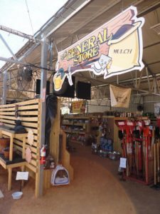
Inside the Front Door
The first thing shoppers notice inside your store is your décor package. We say package because all the elements walls, flooring, primary and accent colors, fixtures, signage, wall striping must work together to tell a single story.
There are two kinds of colors used in store décor: primary colors (neutrals) and secondary colors (bold accents). Primary colors are used in 80 percent of the store’s décor to create a relaxed atmosphere for customers to shop. Accent colors are used in 20 percent of the store’s décor to make it pop. Think of accent colors as attention grabbers.
Once, after a presentation on store design, a retailer approached us and asked if we’d take a look at photos of his newly remodeled store. His newly remodeled, red store! Instead of a store planner, he had hired an interior designer with wild ideas. The floors were shiny red, the fixtures were red, the walls were red, the checkout counters were red… you get the picture. Red is a dominant color, and exposure to that much color makes most people antsy. It’s a great accent color because it stimulates shoppers to make quick decisions, but as a primary color it’s a bust. So we asked the retailer to place an associate at the front of his store for two weeks to clock how long customers stayed in the store. Just as we suspected, customers didn’t stay in the store longer than they had to, and the retailer had to redo his entire store to get sales back on track.
Which Layout Is Right For You?
All store layouts are affected by the shape and size of the sales floor, but the common goals are to expose shoppers to product and gain maximum traffic flow. There are three layouts typically used in store design: the grid layout, the loop (racetrack) layout and the free-flow layout.
Grid. In a grid layout, fixtures run parallel to the walls, so customers typically grab a shopping cart, start in a front corner and walk each and every aisle. They’re easy to shop because they offer clean sight lines throughout the entire store. Another plus: Grids allow for maximum end-feature exposure. Grid layouts can be found in grocery stores, but you will also find them in many big box stores.
Loop. A loop layout offers a clearly defined main aisle that circles the store like a racetrack. Fixture placement in a loop layout differs in different parts of the store: The perimeter fixtures run perpendicular to the wall, and the fixtures in the center of the loop run parallel to the side walls. In a loop layout shoppers typically flow to the right and move up and down the aisles in a serpentine manner. Loop layouts offer maximum product exposure because the perimeter walls are just as important as the end features; the layout leads customers to the wall each time they go down an aisle. Target and Best Buy are good examples of stores with loop layouts.
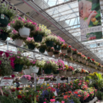
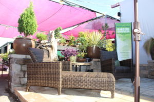
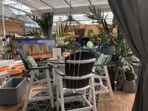
Free-flow. Small and specialty retailers typically use a free-flow layout because it allows for the most creativity: There are no set aisles or straight lines. Instead, fixturing is placed at angles, encouraging shoppers to wander through the store, where they will find new merchandise displays at every turn. This layout offers many opportunities to romance the merchandise and create lifestyle display vignettes.
Get a Blueprint
If you already have a blueprint of your store, you’re ahead of the game. A blueprint will help you determine choice of layout and appropriate locations for merchandise departments. If you don’t have one, don’t worry! Get a large piece of paper and draw a schematic of your own. Measure both the sales floor and non-selling areas, carefully noting all the nuances, including columns, doors, bathrooms and service areas. Next, mount your schematic to a piece of foam-core board, and overlay it with transparent tissue paper. Now, you will be able to merchandise and remerchandise your sales floor on paper before you ever touch a fixture.
A Word About Fixturing
It’s dangerous to fall in love with your store fixtures. Keep in mind that the true purpose of your fixtures is to house merchandise: You aren’t supposed to see them. Target Stores come to mind as a good example of correct use of fixtures. When you think of Target, you get an image of great product; what don’t come to mind are the fixtures housing that great product. That’s because Target makes the merchandise the star. They use basic gondolas and pegboard to maximize dollars per square foot, and display techniques make the merchandise pop. Yes, you will find specialtyfixtures peppered throughout the store, but they are used as features, not to house basic merchandise.
Fixture placement will depend upon your choice of layout. The Americans with Disabilities Act (ADA) requires a minimum of 3 ft. 6 inches in between fixtures (visit ada.gov for more information). The requirement just makes sense; anything smaller and shoppers will be uncomfortable. Grab a shopping cart and maneuver the aisles. Can you do it easily? Do the same exercise with a wheelchair, stroller and motorized scooter. If customers can’t shop comfortably, they can’t buy.
Lakefront Property
Some areas of your sales floor are more important than others. Think of them as prime real estate or lakefront property. When shoppers walk in the front door, they should be surrounded by merchandise this is not the place for the checkout counters or other service areas. Professional store planners know that if you mismerchandise these areas, it will cost you in sales. Here are the key areas you need to pay close attention to throughout your store.
The decompression zone. The decompression zone (DZ) is the space located just inside your front door. The size of your DZ will depend upon the size of your sales floor, but it’s generally the first f5-15 ft. inside the front door. Its purpose is to help shoppers transition between the parking lot and your store; it refocuses the customer on shopping. Your DZ needs to be open, inviting and easy to navigate. Understand that shoppers will miss anything you place here; that’s why the DZ is not the ideal place for shopping carts, baskets or signage. Customers will blow right by them. Instead, place these items just outside your DZ, where shoppers are more likely to see them.
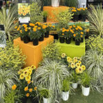
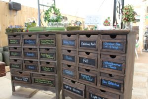
Speed bumps. Just past the DZ is where you place fixtures known as speed bumps. These merchandise displays work much the same way as parking-lot speed bumps: They slow customers down. They also grab shoppers’ attention and introduce them to the cool product for sale in your store. Specialty fixturing, such as slat-board four-ways, make great speed bumps. Small tables work well, too. Use them to feature new and seasonal items, and to tell product stories. And be sure to rotate the product on your speed bumps at least once a week.
Attention: Right turn ahead! Americans shop the way they drive: We have a tendency to turn right when we enter a store. Ninety percent of customers will do this, so it’s important to merchandise this area with care (If your store is located in a country that drives on the left side of the road, then your tendency will be to turn left once inside the store, so just reverse your thinking).
Power walls. Walk inside your front door, stop just past your decompression zone, and look to your right. What you see is called a power wall, and because it’s the first wall shoppers see after turning right, it’s a perception builder. If you use this area to house basic product, you are making a mistake. Put your best foot forward by using this power wall to display important departments, new and seasonal items; create vignettes; tell product stories; and feature high-demand and high-profit items. (Note: Your store has more than one power wall. Stand in various places throughout your store and look around. The walls that stand out are your power walls. Use slat board to crop corners of nondescript walls for instant power.)
The Best Place for the Checkout
A common mistake in store layout is placing the checkout counter smack in the middle of your “lakefront property.” You may argue that it’s nice to have someone right up front to say hello to shoppers as they enter the store, but you can solve that problem with a greeter on busy days. Your checkout should be located at a natural stopping point in the shopping experience: The left side of the store, close to the front is good choice.
And your checkout counter should be designed to sell! Embrace these five rules:
1. Give shoppers enough space to comfortably complete their transaction. This means room for a female shopper to place her handbag and purchase on the counter.
2. Create an interesting display of product behind the checkout counter. You want customers to continue shopping, even while waiting to pay for their purchases.
3. Make sure that your policy signage is friendly, inviting, polite and positive; nuke the “NO! NO! NO!”
4. Load up the checkout counter with “I have to have this!” impulse items and “shut-up” toys as in “Mommy, can I have a ball?” “No.” “Mommy, can I have a ball?” “No.” “Mommy, can I have a ball?” “WHAT COLOR DO YOU WANT?”
5. Stock items that customers need (but frequently forget) under the checkout counters. Then when cashiers ask, “Did you find everything you were looking for today?” and the customer says “No! I forgot _______. I’ll get it next time.” The cashier can simply reach under the counter and grab it instant add-on sale!
Merchandise Outposts
The next time you are in a grocery store, keep an eye out for product displays placed near or in the aisles. These fixtures are called merchandise outposts, and their sole purpose is to encourage impulse purchases. Merchandise outposts make shoppers stop and think, “I need that!” They provide the perfect opportunity to cross-merchandise in a big way. Department stores jump start sales by loading up the aisles during the holidays with merchandise outposts. You should, too!
After you read this article, take a trip to your local mall and study the bones of each store. You will see how these universal store-planning truths have been tweaked for each application. And they will work in your store as well. Whether you’re gearing up for a new store or just in need of a sales-floor shuffle, remember that you are not alone.


 Videos