Revamp Your Retail Series: Signage
For Further Reading
For additional reading about signage studies:
Behe, B.K.; Knuth,M.; Huddleston, P.; Hall, C. 2020. “Consumer Perceptions of Sale Signs and Prices in the Retail Garden Center.” Journal of Environmental Horticulture, 38(4):120–127.
Huddleston, P.T.; Behe, B.K.; and Tuski, M. 2023. “A Shopper’s Journey.” Journal of Retailing and Consumer Services.
Knuth, M.; Behe, B.; and Huddleston,P. 2020. “Sign Complexity Effects on Purchase and Attractiveness.” Interdisciplinary J. of Signage and Wayfinding, 4(2):7-23.
For additional reading about plant benefits:
Hall, C.R.; and Knuth, M.J. 2019. “A Review of the Emotional and Mental Health Benefits of Plants.” Journal of Environmental Horticulture 37(1):30-38.
Hall, C.R.; and Knuth, M.J. 2019. “An Update of the Literature Supporting the Well-Being Benefits of Plants: Part 2: Psychological Benefits.” Journal of Environmental Horticulture 37(2):63-73.
Hall, C.R.; and Knuth, M.J. 2019. “An Update of the Literature Supporting the Well-Being Benefits of Plants: Part 3: Social Benefits.” Journal of Environmental Horticulture 37(4):136-142.
If labor were unlimited and free, retailers wouldn’t need signs; customers could simply ask a question and get an answer.
Signs are used in three basic ways: identity, direction and information. The identity signs are how individuals know where the business is located and, potentially, what the business is or does. Even with a few feet of snow on the ground, a driver could pass Koetsier’s Greenhouse sign and know that the business is a garden center.
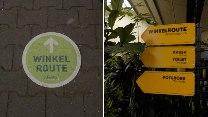
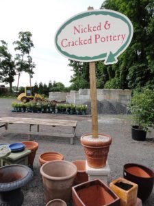
Wayfinding is the second key way people use signs. One successful example of wayfinding is “the Winkelroute,” used by many garden centers in Amsterdam. The Winkelroute is the main avenue through which the retailer wants to direct customers to go in order to see the entire store. At Schmitz, the route was marked both on the floor and with arrow-shaped signs. The Winkelroute lays the store out more as a journey than a grid.
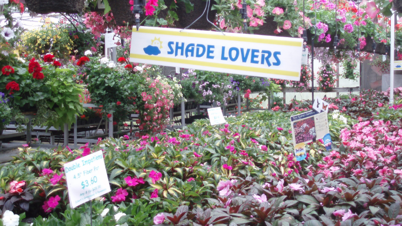
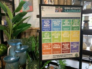
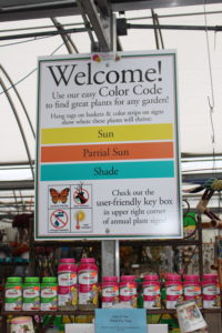
Informational, or educational, signs are typically the kinds of signs we think about having in the retail arena. Signs with price are one of the more common informational signs, since it is hard to make a purchase if you don’t know the price.
One study we conducted in four retail garden centers in Michigan allowed us to recruit study participants from their customer list. We had the participants wear eye-tracking glasses. Results showed that two-thirds of the study participants looked at a price sign (the other 33% never looked at a sign with a price) — so price isn’t the only piece of information consumers need to make a purchase decision. Compare that to 88% of those study participants who looked at an information sign (without price).
In a separate study, we demonstrated that higher prices were seen faster on a sign on the left side of the display, compared to the right side. The take-home message for this finding is to put higher prices lower and to the right of the sign and lower and right of the display.
When a sign has a price in a large font size (that can be read from 25 or more feet away from the plants), you give the potential customer a reason to not come closer if they think the price is too high, or they don’t see the value in that plant from that distance. Don’t lead with the price for higher-margin, higher-priced items; lead with plant benefits. (See Part 1 of this series in the January issue or at lgrmag.com/revampmerchandising for more on eye tracking studies and plant purchases.)
Image Congruency and Plant Purchases
Should you show people or plants on the signs in the garden center? The answer is both. In my visits to garden centers, I’ve noticed that signs depict plants in the mature stage. It makes sense that we want people to understand the potential of that plant and its future value. For annuals or perennials, images of flowers in bloom are most often included on signs.
Our research shows that the image congruency theory works for plant sales. The image congruency theory holds that people will relate more to images of people who look like they feel, rather than a product alone. In other words, if a 30-year-old woman sees only 65-year-old women with floppy hats and white hair in a sign or advertisement for a plant, the 30-year-old woman is not as likely to relate to the plant, compared to showing either a 25- or 30-year old woman or the plant by itself.
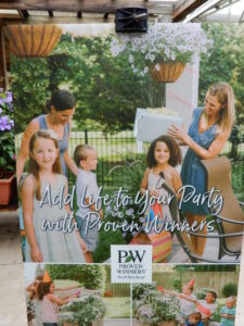
We tested the theory with several female models from two age groups (one 25 to 35 years old and another 55 to 65 years old) and found that, when the model and the viewer or consumer were of the same ethnic heritage and age, the viewer or consumer found the model more relatable and attractive. In other words, garden retailers should reflect the age and ethnic diversity of their local market on their signage.
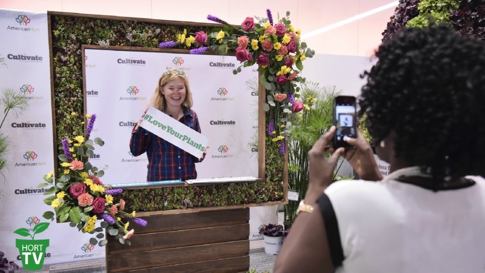
Wedel’s Nursery, Florist and Garden Center displayed a Proven Winners banner that demonstrates image congruency. Not every sign needs to depict people, but use images that help to reflect the diversity of the market you serve or want to serve. If potential customers see themselves in the images on your website or in your store, they are more likely to connect with the product. If they don’t see themselves interacting with plants or other products you sell, they are less likely to relate to them and buy them.
Think about the people you see in advertisements for other products or services. Often, they are deliberately chosen to make the product more relatable and appealing to that particular market segment.
Red-Hot Sales?
Sale signs traditionally use red fonts. Would it surprise you to know that very little research has been conducted on the use of red (versus black fonts) for the word “sale”? When the word “sale” was in a black font and placed to the left on the sign, people were more likely to buy a plant from that display. When the word “sale” appeared in red and on the right side of the display, however, they were more likely to make a purchase from that display as well. Larger or smaller fonts (compared to other text on the sign) for the word “sale” didn’t increase the likelihood to buy from the display.
The take-home message is mixed; larger or smaller fonts for the word “sale” won’t increase a customer’s likelihood to buy. Using the word “sale” alone and not adding any other information, however, did increase the customer’s likelihood to buy a plant from the display.
Varied Complexity
How much information should a sign have — and how much of that information do customers read? We conducted another study in which we had 15 signs that a panel of experts rated as low-, moderate- or high-complexity signs. The low-complexity signs had only print (no images), while the moderately complex signs had some different fonts and an image or two. Highly complex signs had multiple fonts and images.
While the highly complex signs were rated by study participants as the most attractive, they were more likely to read more information and buy something from the moderately complex signs. In other words, consumers “cherry picked” the information from the highly complex signs, rather than reading it all.
The key message here is to use a variety of signs. Simple signs with the word “sale” and the price are ideal for those bargains you want to persuade customers to buy. Moderately complex signs might contain some product features to ensure they get the right plant in the right place. But highly complex signs might be best used for higher-margin products or new products to help convey a lot of information. Plant benefits might be one of those key pieces of information on a complex sign.
Feature Focused
Features are characteristics about the plant, such as how tall the plant will grow or the flower color. Benefits are what the plants do for the buyer. Plants have many benefits, which add value to the plants that retailers sell.
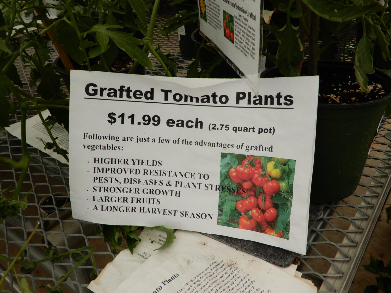
The Horticultural Research Institute funded several studies in which researchers synthesized the plethora of research documenting those benefits (see the Hall and Knuth series of four publications in the sidebar). Plant benefits were categorized as mental, physical, emotional, social, well-being, beauty and education. One study showed that customers are willing to pay more for a plant when benefit information is shown compared to product features (e.g., how tall the plant grows, what color the flower or fruit is, etc.). In other words, when the product is higher-margin, use plant benefit messaging.
Humans are naturally drawn to see differences. The signage in your garden center can capitalize on that. You want more attention drawn to higher-margin items, so focus on plant benefits for those signs, drawing customers closer to learn the value added by those benefits. Put price signs lower and to the right side. All of those informational signs for plant features are useful; we want people to get the right plant in the right place. Those features, however, aren’t adding value to the plant. Diversify your signs, getting the right type of sign for many of the plants you sell.
For an enhanced reading experience, view this article in our digital edition.



 Videos